
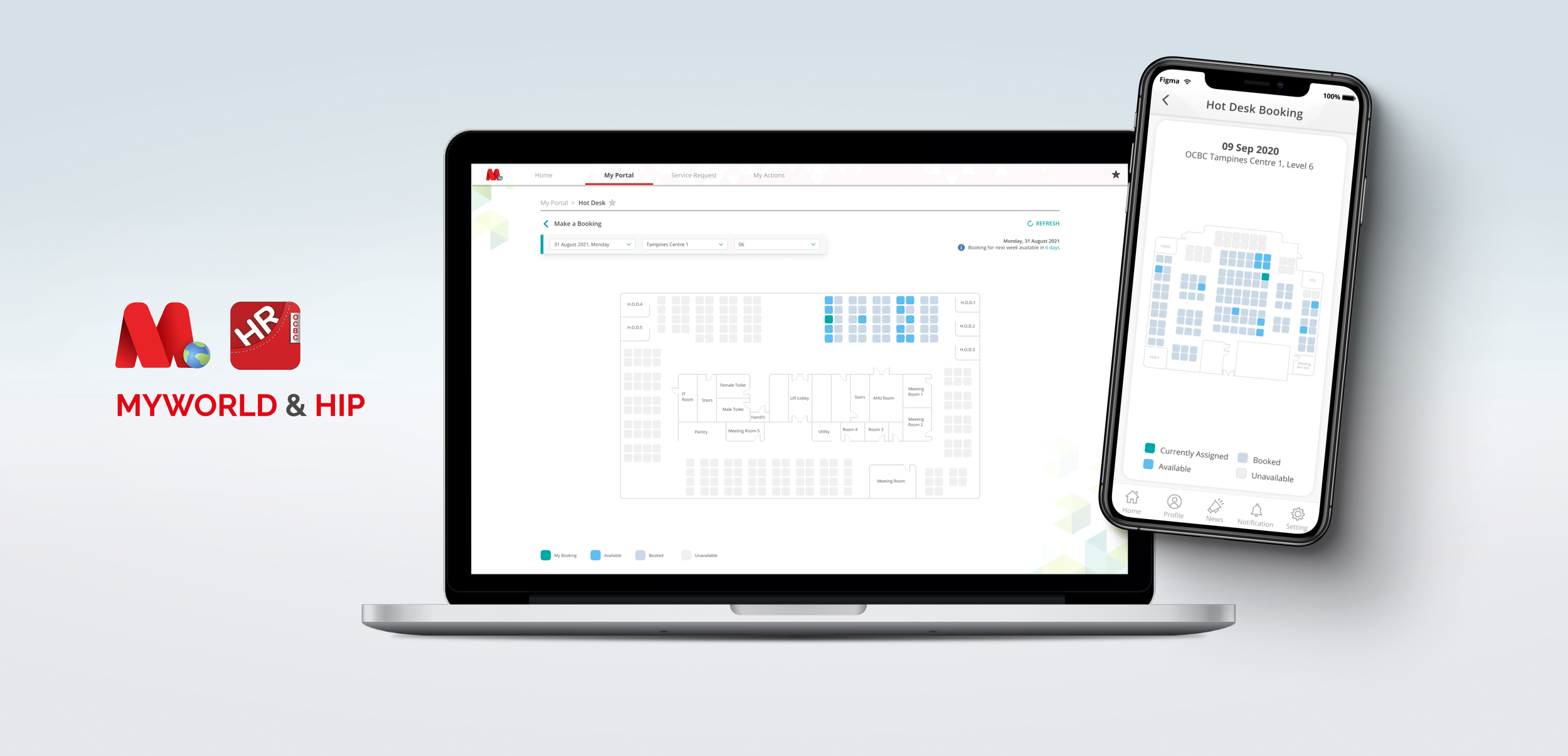
MyWorld & HIP: Hot Desk Booking
In early 2020, the Covid-19 virus hit the shores of Singapore and caused a lockdown. During this period, the organization started planning for life after the lockdown. A few issues rose to the surface the first week fellow colleagues went back to the office.
Seating capacity has been reduced due to the pandemic, national policy, and the tightening of purse strings.
Up to 50% of employees who are able to work from home can be at the workplace at any point in time. For example, a company with 100 employees who can work from home can have up to 50 of these employees at the workplace at any point in time.
Floor managers had a hard time tracking personnel movement and floor capacity.
The organization had to report daily capacity values to a statutory board, and would occasionally get spot-checks by authorities to ensure the bank adheres to national policy.
At this point, many teams and departments were in the process of transiting from cubicle-based working environments to a hot desk system.
Certain desk clusters weren’t designated Hot Desks resulting in disputes between teams looking for a desk space.
My Role
Designing both the Booking system and the Floor editor / manager was a three-month long and project. The team consisted of myself, another UX designer, 3 engineers, and a product manager.
I was responsible for the visual design, user flow for View, Book, and the Floorplan Editor.
The research work was shared among myself and the other UX designer. The analytics and “Back-office” platform to generate daily reports was also designed by my colleague.
The Problem
Confusion was abound and team leaders started drawing boundaries. It was clear that the situation was unsustainable, and a solution had to be found to solve these problems.
The MyWorld & HIP team was approached by various business stakeholders to solve these issues.
The team had gained notoriety for transforming and streamlining processes within the bank, and we were certainly up to tackle such a challenge.
The design team, consisting of myself and one other UX designer at that time, split the research work, interviewing employees in various capacities to determine the crux of the issue. We plotted and empathy map on the left image, and organized the findings into opportunities.
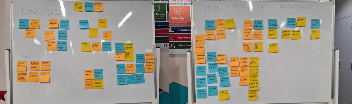
Empathy maps
Insights
Problem Statement
Design Solutioning
I needed a way to allow staff to book seats. For that there has to be a visual UI for them to make bookings. I started by creating a mockup after doing research on how conceptually similar businesses such as cinemas allow bookings. There has to be a basic floorplan for users to navigate and identify which seat they’d like to book.
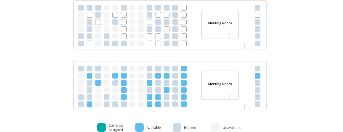
There also has to be visual indicators for booked seats versus empty ones. I chose a simple representation of a basic cushioned chair as a “seat” for users to book.
To complicate matters, there were a portion of teams which were categorized as critical function teams, and would be assigned a permanent desk.

First iteration of a floor plan
While it was simple to understand, a colleague mentioned that the seats looked like tombstones... Not good!
I agreed and decided it was prudent to simplify the design further, lest it gets taken the wrong way. While black and white works, it was still pretty harsh to look at, especially for offices with many desks stacked together. Armed with feedback from various colleagues, I decided on a theme that also adheres to the existing design system.
Floor plan iterations
An A/B test concluded that a color-coded blue seat was immediately recognizable to our users at a glance.
There were many ways to depict an empty seat and I settled on these. From our users’ standpoint, we found that they would like to know which seats were “Booked” versus “Unavailable” because they could then plan seating arrangements in the future with their fellow team mates.
It also helped users who were new to the office navigate, knowing that there were landmarks, and “unavailable” seats were also important landmarks.
The introduction of colors also meant a legend was necessary for users to distinguish the seat’s status.
Designing a Booking System
With the help of my colleague, we looked into various competitors and did our market research. I dove right in and created a user flow chart of how a user might interact with this booking system.
I interviewed employees across multiple divisions to find out their use-cases, needs, and wants for such a system.
I agreed and decided it was prudent to simplify the design further, lest it gets taken the wrong way. While black and white works, it was still pretty harsh to look at, especially for offices with many desks stacked together. Armed with feedback from various colleagues, I decided on a theme that also adheres to the existing design system.
Initial dialogue iteration
Choosing a contextual dialogue proved to be a good choice among my users, because they felt that it was less intrusive than a full modal which interrupts their train of thought.
I found that most employees do not know if they had to be in the office the next week. Some would only know if they were required to return a few days before, if not on the day itself.
That and coupled with the fact that many stakeholders were worried about seat hogging. They’ve had bad experiences regarding the booking process for meeting rooms where some teams would book a room in advance for days on end.
With these insights, it was decided by the product manager of this feature to only allow bookings for only a week. Employees weren’t keen on dealing with a booking everyday. It was too much of a hassle on top of the increased pandemic protocols.
There were still intricacies within the system I have to solve. While booking a seat, how should a user select which days of the week she would like to book? Would there be AM/PM check-ins?
Employees weren’t keen on dealing with a booking everyday. It was too much of a hassle and they preferred some form of advance booking.
Stakeholders were wary about desk hogging.
An accomodation was made for a week-long booking window.
This dialogue interaction was chosen because I did not want to disrupt users from checking a seat’s availability for the week.
Initial usability tests suggested that users expected to book seats right after clicking the “Book Seat” button on the left, and did not expect that they would be able to select dates.
During date selection they were unsure of what to do. On realizing upon seeing the changes in hover states that they could click on the numbers. Some users also tried to click on the labels for days, expecting a change in dates.
The design language for this component resembles buttons, making it intuitive for users to know that it is interactable.
There were also edge cases that needed to be handled. For instance, if a user already booked a seat in the same week, could she then book the currently selected seat?
To streamline the booking experience, I aim to prevent users from navigating between the summary page and back, just to change their booking.
Through usability tests, a large majority preferred a sliding interaction, which they were used to doing to navigate to the previous screen.
Example where animation gives context to navigational interaction
Users of this system also wanted to know who was occupying a seat, so they may either contact the person for an exchange, or just get to know their neighbor!
Track Your Bookings
After making a booking, it is only natural that users would like confirmation and an area to double check their booked seats. This feature also doubles as a landing page for employees to view and track their booking calendar.
From initial interviews, I have gathered insights that informed me that this feature should also be a hot desk bookings management page where users may edit, delete, and track their bookings.
As a critical functions staff, I need to easily track my booking for the day, and also guide me to my seat if it’s an unfamiliar office.
This design serves to mentally relate the concept that only 5 days can be booked. Seeing only 5 boxes, laid out in he format of a calendar view, users could easily attribute one booking to one date.
It was also important that we were able to scale up the system from a week’s booking to 2 or 3 weeks depending on feedback we receive and our stakeholder’s decision.
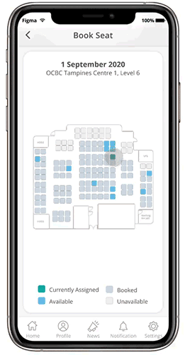
The mobile version in HIP also follows the same design language, making it easy for users to navigate between devices.
On mobile, employees usually want make a last minute booking, or to view, then find the seat that they have booked.
Office Selection
To begin booking, users would have to select the building and level they want to work in. Only then will the system start loading the office’s floorplan for seat selection.
With this weekly booking system, users can only book seats for the following after 3pm every Friday.
Due to the insights stated above, our users and stakeholders were hesitant about allowing staff to book seats too many days in advance. We settled on 1 week during the pilot launch to gauge ground sentiment and gather more feedback. Stakeholders were amenable to adjust a 1 week booking cycle to 2 weeks depending on the need.
Thus far, most people were happy with a 1 week booking cycle, and there was no inherent need to book in advance because employees now have the choice of seating on other floors.
With this system, employees now have the choice of accessing seats on other floors. They no longer need to coordinate with other floor managers to work in another office level.
This form-like inputs were immediately familiar to our users because of existing mental models. It was easy for them to use. By placing the selection at the top, users understood that a corresponding floorplan will be loaded based on their selection. Without having to navigate to the main menu, users had the ability to change the date, or office, to suit their needs.
Their booking for the day will also be shown in the teal area, allowing them to also easily delete that particular booking without needing to scan the floorplan.
Floor Management
An integral part of the booking system: the floorplan. Without which users will not know which seat they were booking, nor its location. We needed something that was easy to use, and maintain for our users.
Floor administrators weren’t designers or developers, but they were familiar with using MS Paint, and PowerPoint. We needed to create a floor editor that was easy to use.
The team admittedly spent quite a large portion of our time thinking about a solution to this problem. We didn’t want to run into the problem where the maintenance of the floor plan was pushed to us. It was impossible for our small team to dedicate resources to build and maintain more than 150 floors.
Based on my original iteration, we put our heads together to find the easiest way we could build this tool.
The organization had buildings across the globe in varying shapes. We also didn’t want to deal with various table shapes. Hence the team collectively decided that “Seats” were universally understood.
I designed a tool that could simply draw pre-determined lines or curves. While accuracy not wholly necessary as a hot desk booking system, it was requested by some of our users, as they agreed that blocking out the edges of the building made it easier for employees to navigate.
Seat availability can be customized to dynamically allow only employees of certain departments / divisions access.
With this level of customization, floor administrators can limit the amount of desks available for booking in their domains.
Users could also easily select seats once they’ve placed them to change the seats’ availability status. These interactions make use of mental models established by software our users are familiar with, like PowerPoint.
To make enumerating desks easier, the seat drawing tool allows users to input an alphabet or a prefix and will enumerate each seat drawn starting from the number “1”
Once customization is done, saving the floorplan will update the current live UI for the next weekly cycle.
What about checks and balances you might ask? From our interviews, no one is more knowledgeable than the floor managers and administrators themselves. Even if a mistake was made, they could easily make the edit before the stipulated cut-off timing, and the front-facing UI would be updated accordingly.
Identifying Seats in the Office
What is a booking system without real-world markers? Users wouldn’t be able to identify “Seat A12” just by looking at the floor plan.
For that, I decided to create table labels. These are specifically sourced and printed to be cheap to produce, eye-catching, easy to install, and easy to remove in the event tables are shifted and new battle lines are drawn, as teams are wont to reshuffle.
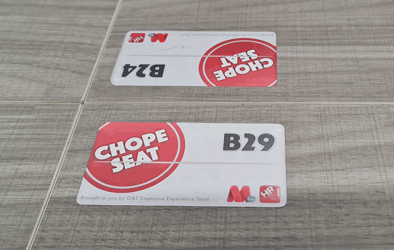
“Chope” is a Singaporean slang for “Reserved”. This label is also designed to look like a packet of tissues, usually left on hawker tables to indicate the table has been reserved.
Reflections & Outcomes
This project was admittedly one that challenged me. It was something that was familiar but yet at that time, there wasn’t many apps that were similar. Not to mention that the requirements we derived from user interviews and stakeholders were wildly different from any other market competitor.
As I understand, many hot desk booking apps only allow booking on the day itself. I had to sit with the team to brainstorm various ideas to solve the problem that advance booking creates.
The problem of managing and creating floor plans were another roadblock. I personally came from video game development, level editors were a big part of what made games fun. I took the knowledge and experience with level editors and translated them into MyWorld. It took a bit of convincing for stakeholders finally buy-in to the idea.
I spent plenty of time researching end-to-end solutions as well. My knowledge and skillsets from working in an agency served me well. We contacted many service providers and looked into various technologies, like sensors, or cameras to automate and track hot desk usage.
Ultimately, most of these solutions weren’t cost effective. In fact, they were counter to our business goals of indirectly cutting costs, by empowering our workforce to be more efficient.